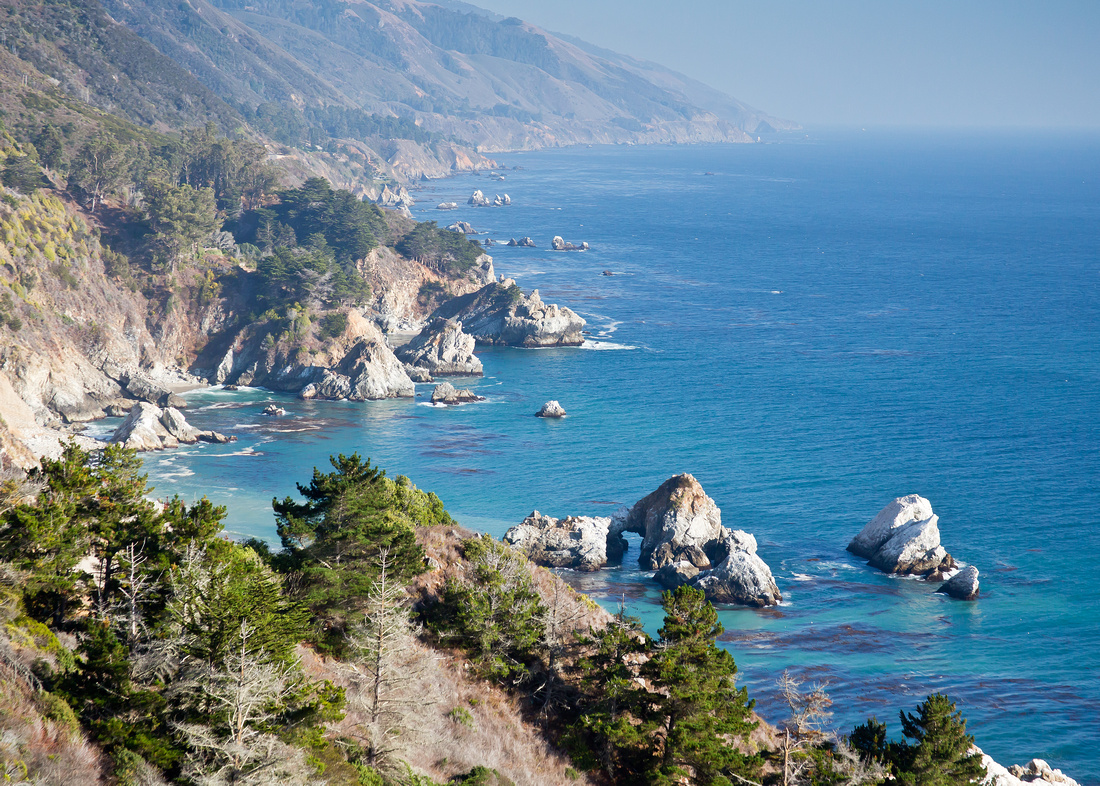
Michele and I drove from Santa Barbara to Monterey Bay 2 years ago and it was one of the best vacations we've had. It's also a photographer's dream and some place I could spend years exploring. The big in Big Sur certainly holds weight here. Everything is on a grand scale. Big cliffs, big ocean, big view, big trees and big animals.
Here's a view looking back down the coast to the south after crossing a bridge. Some of the homes here are big too, and spectacular to match.
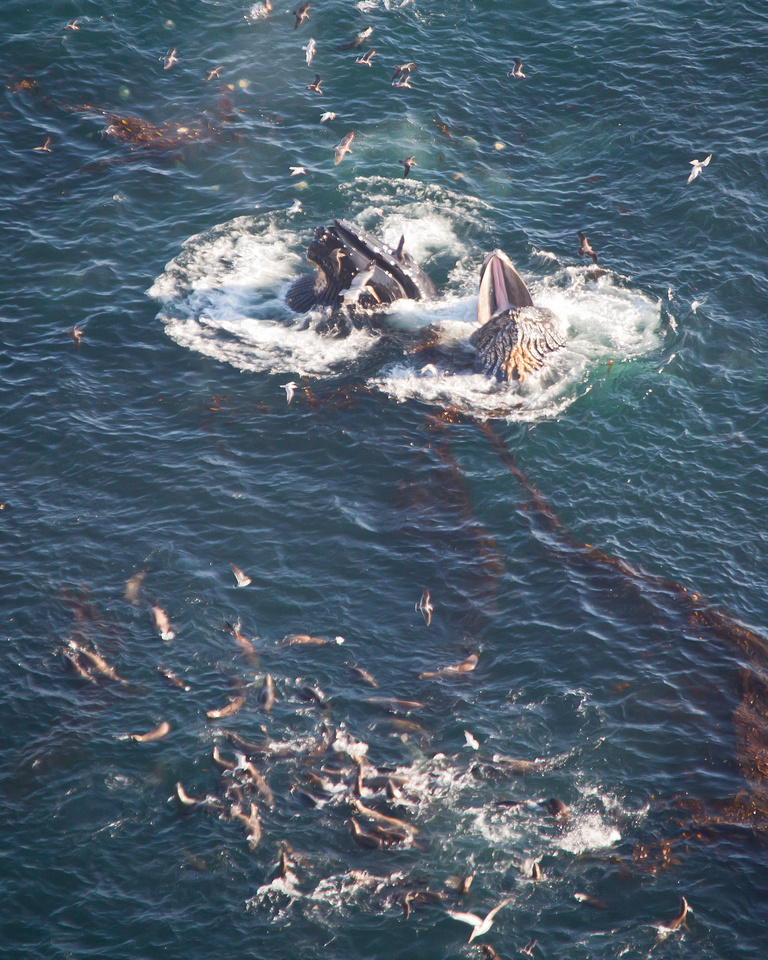
All along the drive, we saw plumes of mist exploding into the air from the pods of humpback whales surfacing to breathe. When we passed a spot where cars were stopped and their occupants were staring over the cliff and chatting like giddy school kids. What we found was that we were about 600 feet over the ocean and directly below us was a pod of humpbacks feeding. AMAZING. I added a doubler to my 200mm lens and took a variety of shots as the whales circled underneath blowing bubbles to create a 'net' to trap their food, then surfacing with mouths agape to filter the krill out of thousands of gallons of water with each mouthful. Even at this height, it was easy to hear them communicating with one another, slapping the water and clearing their blow holes and taking breaths. All around them circled sea lions which you can see at the bottom of the photo. I wonder if any of them accidentally get swallowed up? What happens then? Game over I'm guessing. Makes me reconsider my thoughts of how amazing it would be to be one of those kayakers you see on the internet who've taken the amazing videos of whales surfacing and eating just feet from their boats. What happens if YOU are in the middle of one of those mouth fulls?
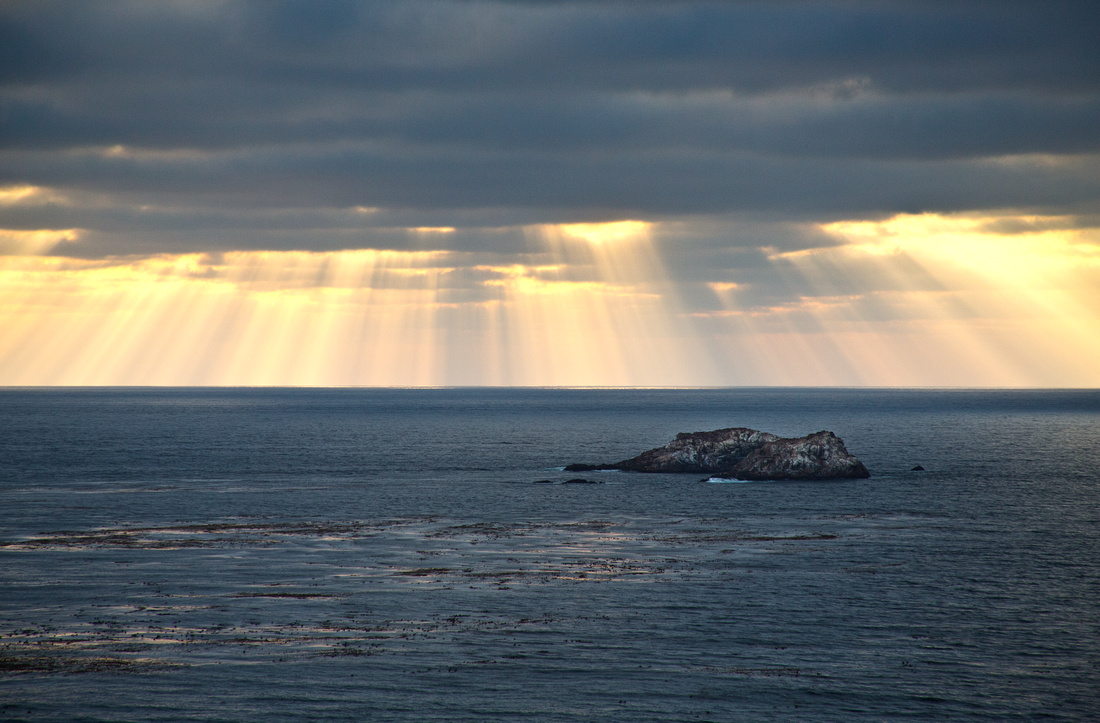
The sun set not long thereafter. I wish I could spend days shooting the sunsets, sunrises and views in Big Sur. The sun shining through the clouds looked like showers of gold dust falling from the sky.
]]>The real light quality of this image shows when it is front or back lit with high-quality lighting.
 Here's the image in a large scale installation setting.
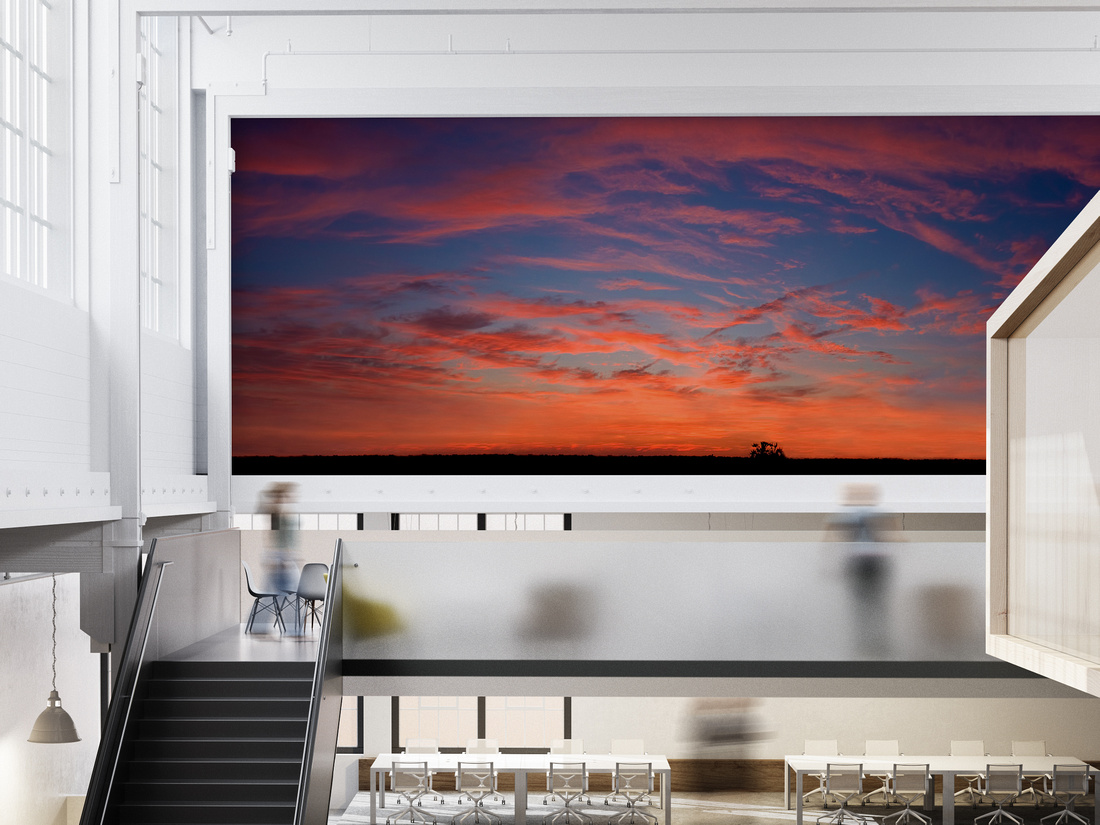 Arguably the most successful living photographer today, Peter Lik is a master at capturing the quality of light and reproducing it in his final images. Take a look at some of his images on his site with this "sunset" search:
Eric Snethkamp
Snethkamp PhotoArt
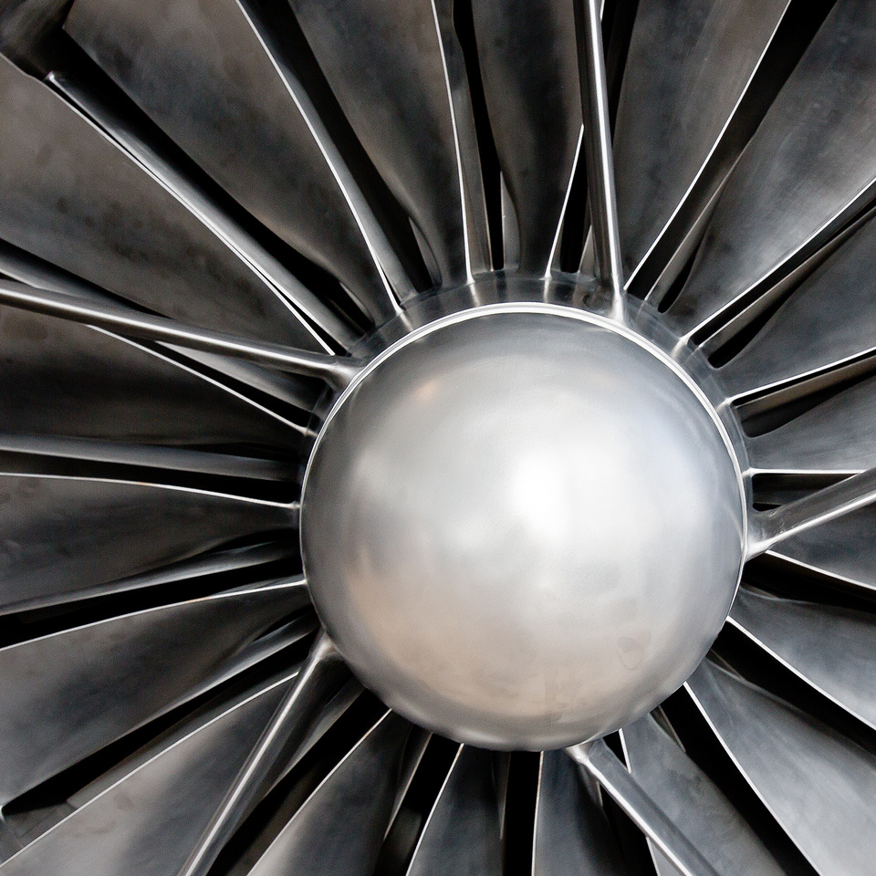
]]>This particular engine sits in the lobby of the private Austin Executive Airport on the northeast side of Austin, TX. It's been meticulously restored and sits on display for all to see up close and personal. There's something amazing about the seemingly endless network of parts that make up this marvel of engineering.
Ron W. Henriksen is the brainchild and founder of Austin Executive Airport and he's written a very interesting history of how it all came about. Chapter 11 details how he purchased and restored the Rolls Royce engine. The entire book can be read at this link: Austin Executive Airport: A History
Thanks to Mr. Henriksen for sharing his passion with us and for preserving such an amazing piece of aviation history.
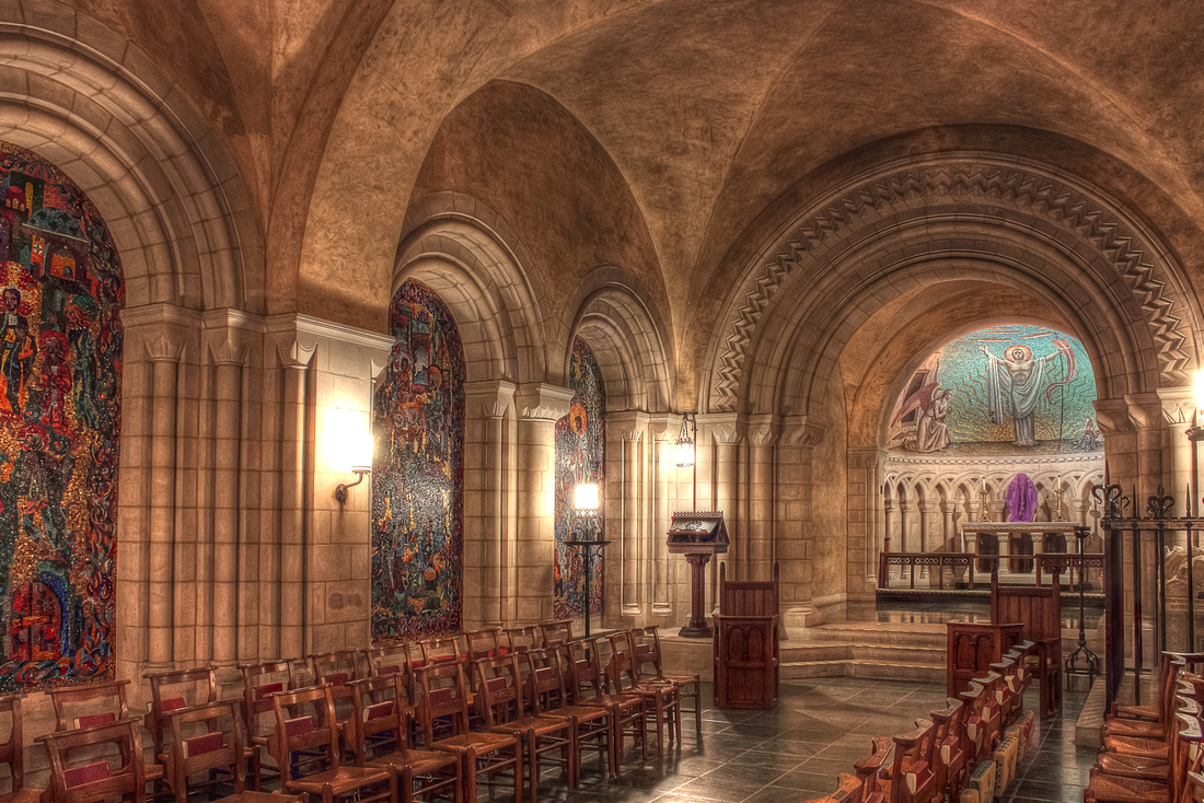
This photograph was taken in one of the secondary chapels which is also a crypt. The crypt contains the remains of a number of former priests from days gone by as well as some amazing wall illustrations and textures. Being that this was one of my early photos HDR was a technique I practiced quite a bit and which allowed me to capture a quality of light that translates the feeling of the chapel quite well.
If I could change one thing it would be the lens I shot this with. At that time I didn't have a quality wide angle lens like I do now. That lens would have allowed me to capture so much more of the rooms character and historic inhabitants. In fact, I believe I would have some incredible shots from the main chapel as well with that lens.
I'm always interested to know what you think.
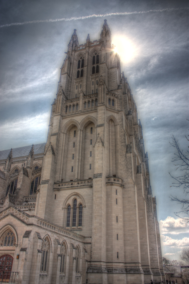
And, here's an HDR image of one of the bell towers.
One of the potential problems with HDR photography, especially a few years ago in its infancy, is the tendency to over process. Over processing creates a variety of artifacts in an image and can lead to a very surreal or fake looking image. I've learned a lot since taking this photo and it's highly unlikely I would call this image a final product in my current process. However, if I shot this photo today I don't think I would have stuck with this image which, although over processed, has a wonderful quality about it.
I've exhibited this photo and shared it quite a bit and people always seem to have a strong opinion about it. Some dislike it, many like it, and almost everyone thinks it looks a bit "spooky". How wonderful! After all, isn't that what makes an image or a painting or any other work of art remarkable? Whether people like it or dislike it, almost everyone feels strongly about it and that's what makes it a great image. There's not a whole lot of middle ground but rather a love it or leave it feeling and a reaction. Either way, it stirs emotions.
How does this photo make you feel? What are your thoughts? How do you think it would look printed life-size and displayed in a large lobby or on the side of building?
You can read more about HDR photography in my post about HDR master Trey Ratcliff.
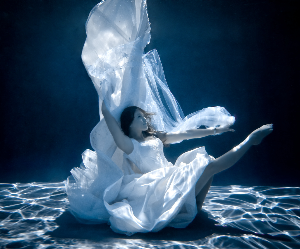
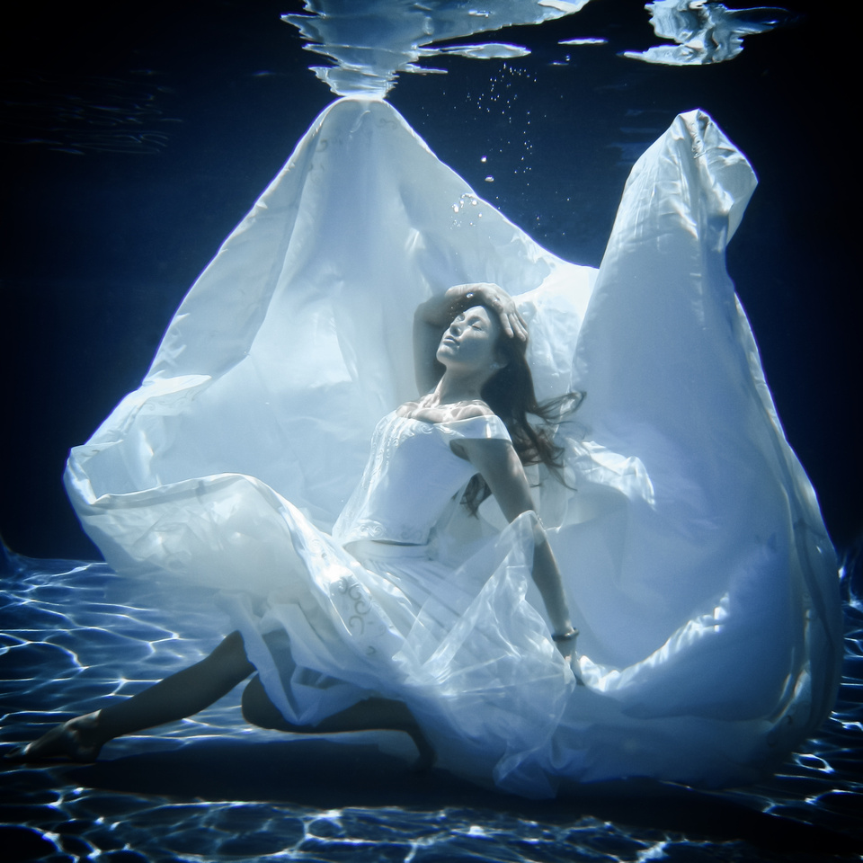
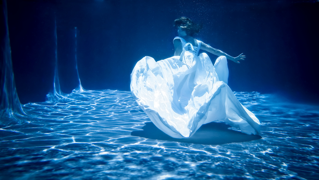
]]>I'd wanted to do an underwater shoot for some time and things finally came together when Anne volunteered. She said she had a wedding dress that would could look great underwater because of it's variety of fabrics and the way they would move in the water. However, some of the fabric would be quite heavy once water laden and we were both concerned for her safety once she was in and weighed down and her movement restricted.
We gathered a few friends, one of which would be Anne's "lifeguard" right by her side throughout. Good thing too as he came in handy pulling Anne from the deep end to safety on several occasions. Don't try this at home kids!
Then we headed to my brothers pool. My brother Christian lives in San Antonio and built this pool in his back yard with a great medium grey color bottom. That color helped a lot in creating the look of deep open water. It doesn't hurt that it's a fairly large and deep pool but the color really made it amazing.
The dress, in several iterations of fabric layers, worked well after overcoming some issues and we ended up with several shots that I like a lot.
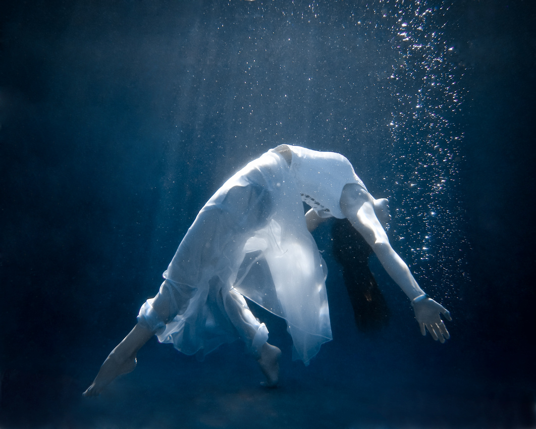 As for how I shot these? I'd like to say that I used my high end camera gear with underwater lighting and expensive underwater camera housings. However, I like saying even more that I shot these on two simple point and shoot cameras that can be used in water as deep as 10-20 feet. These cameras can be bought at Best Buy for a couple hundred bucks. Thanks to Christi Douglas Ford for lending them to me.
That being said, the images certainly don't come out of the camera looking like this. There is a lot of artistic PhotoShop work in these images.
So, who is Anne Shackelford? Anne is a friend I've shot with before. You'll see some of her and her work in my "Queen of Hearts", "Body Painting" "Boudoir" and yoga images. You can see those images in the "People" gallery however the "Boudoir" gallery is only viewable by it's participants. Anne is an incredibly talented artist specializing in hair, body painting, clothing / costume design, yoga instruction, and a variety of other arts. Here's a link to her website Chrysalis Austin:
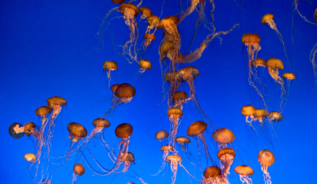
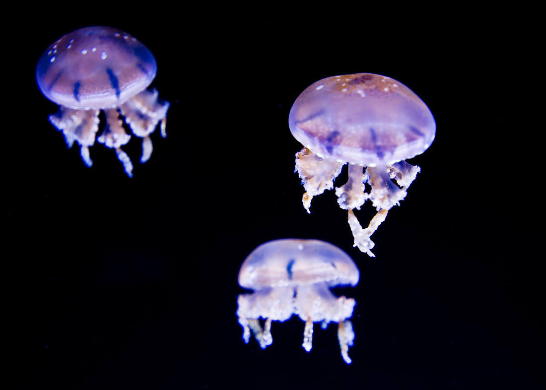
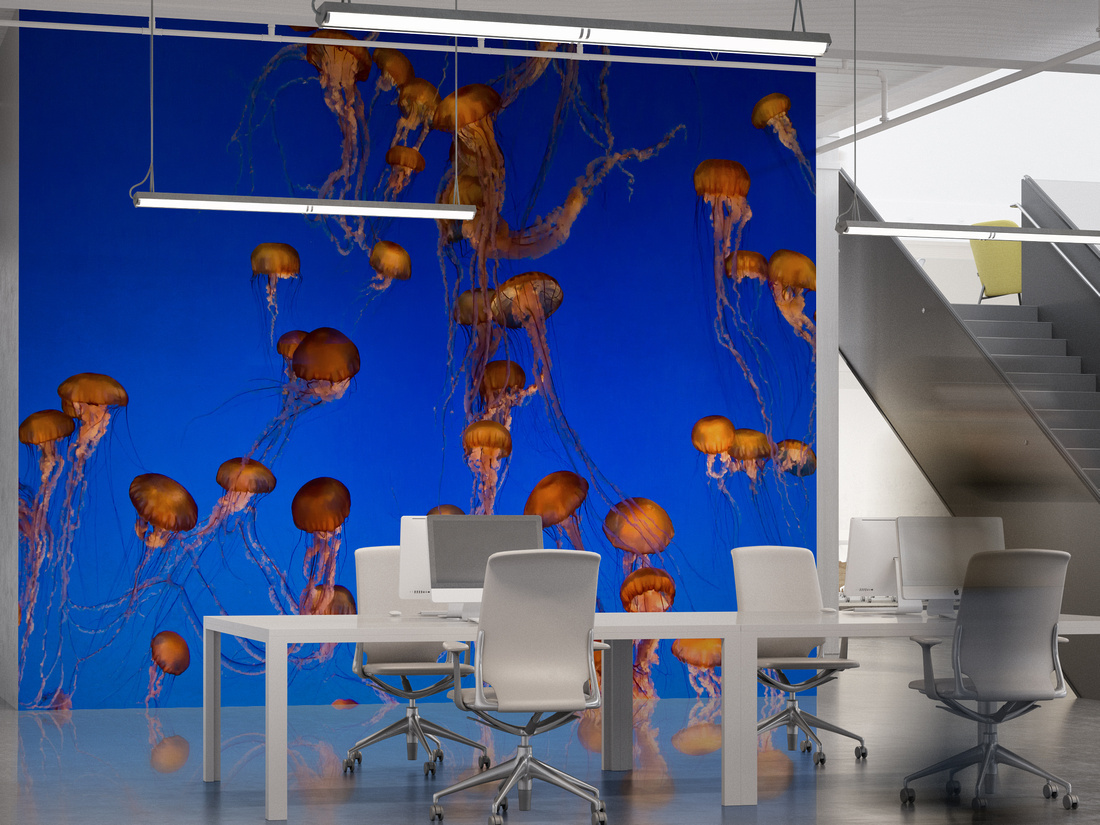
Photos like these make incredible statements when they're displayed at very large scale. They almost transport you into the ocean environment.When standing in front of one of these you can almost hear the sound of being under water and smell the ocean. The captivating depth of color and the strange yet comforting forms of the jellyfish can be mesmerizing.
]]>
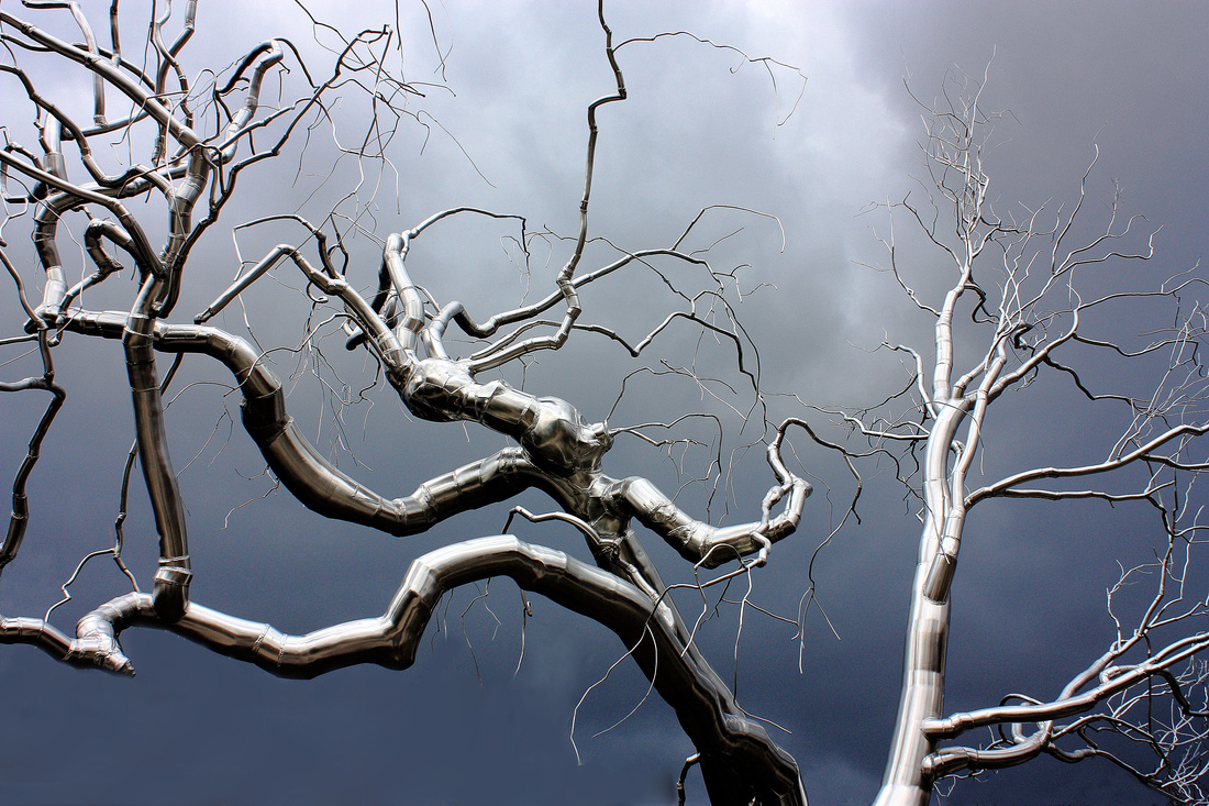 That's the most common reaction from people. A lot of people have told me they thought it was a computer generated image or some kind of painting rather then a photograph.
What you're seeing is a photograph of life size sculpture of a tree. I came across this sculpture at the National Gallery of Art Sculpture Garden. It's really impressive in-person. Even more so on this day when a storm was quickly approaching. That storm rained and hailed on us just minutes after this photo was taken. It did create an incredible backdrop complimenting the natural shape and highlighting the shiny surface.
The artist is Roxy Paine and the sculpture is called "Graft" from his "Dendroid" collection.
Here is a description with a link from the museums website:
Overview: At 45 feet high by 45 feet wide, Graft (2008–2009) by American sculptor Roxy Paine stands out among the trees in the Sculpture Garden of the National Gallery of Art, one-half mile from the United States Capitol on the National Mall. The Gallery commissioned Paine to make a "Dendroid," as the artist calls his series of treelike sculptures, for the Sculpture Garden. The newly installed work is the first by Paine to enter the Gallery's collection, as well as the first contemporary sculpture to be installed in the Sculpture Garden in the 10 years since it opened.
Made from more than 8,000 components, the stainless steel structure—which weighs approximately 16,000 pounds—was installed the week of October 26–30 by Paine and his crew. The 43-year-old artist has shown his other Dendroids on the roof of the Metropolitan Museum of Art (New York), in the Olympic Sculpture Park (Seattle), and outside the Museum of Modern Art (Fort Worth, Texas), among other locations.
http://www.nga.gov/content/ngaweb/exhibitions/permanent/paine.html
And, here is a link to Roxy's website and his "Dendroid" collection:
http://roxypaine.com/dendroids/
]]>
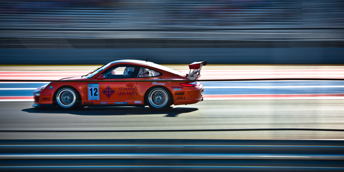 Here is one of my favorite shots from my time volunteering at Circuit of The Americas. This very tough to capture image of the Pirelli GT3 Cup Trophy #12 Porsche driven by Dan Weyland with St. Mary's University decals on the doors came out especially well. The photo was taken as the cars are flying through the high speed S's of turns 2,3,4 and 5 at well over 100 m.p.h. From the vantage point of the inner track road it's like watching a fluid back and forth dance at the limits of what's possible. In the car it's a g-force filled side to side roller coaster that seems to go on for ever. Did I mention that Dan was 73 years old at the time of this photo?]]>
This is going to be a special blog post for me. It’s special because of who i’m writing about, Trey Ratcliff. Those of you who are familiar with my photography know that I am a big fan of HDR photography when it is done correctly. And by that I mean done with finesse and not ridiculously over processed. Don’t get me wrong, there is a time and place for extreme processing and it can create a wonderfully artistic image, but I appreciate the use of restraint with HDR. My ideal use of HDR is to create images that are more “ultra realistic” than they are “surreal” or “cartoonish”. HDR is a tool a photographer can use to create images that are simply impossible to capture with current camera technologies. It gives us the ability to share more of “what it’s like to be there” than what we traditionally see with a single photo.
That brings us to Trey Ratcliff. The vast majority of photographers who know of Trey would agree that he is the father of modern HDR photography. He is also the leading teacher of HDR techniques in the world and one heck of a nice guy. Trey is the reason I'm so fond of HDR photography and the driving force behind my continual quest to hone my skills.
Trey began his HDR journey here in Austin, TX but has recently moved to New Zealand for the seemingly unlimited number of incredible landscapes to photograph.
One of his early HDR images “Fourth on Lake Austin” was the first HDR photograph to hang in the Smithsonian Museum:

Trey does as much teaching as he does photography and his web site Stuck In Customs has become a veritable encyclopedia of HDR knowledge, instructional video’s, product reviews, social media and photography networking info as well as consistently updated photographs created by Trey. If you are a photographer or simply appreciate incredible imagery you owe it to yourself to explore his site, sign up for his newsletter, watch his podcasts and learn more about Trey Ratcliff and his talents.
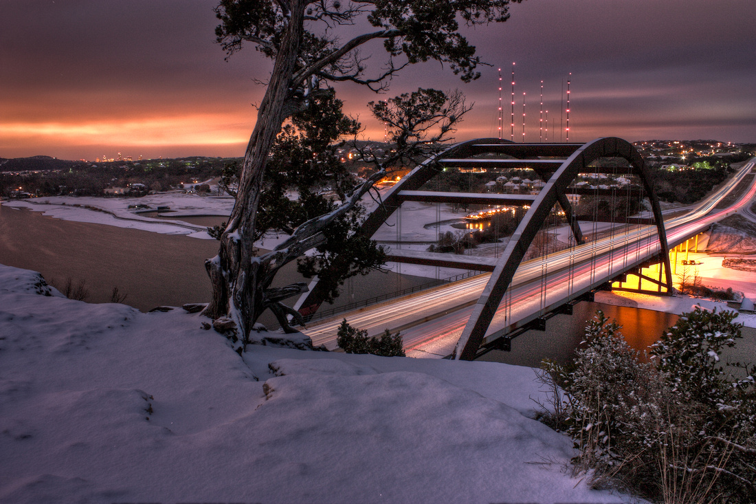
Here is the HDR photo I shot overlooking the bridge that Trey shot his fireworks photo from:
Dawn Over Snowy Austin
Ok, enough about how much there is to learn, let's talk about one of the best ways to learn. Enter Micheal Zelbel and Smoking Strobes. I first came across Smoking Strobes while searching for photography podcasts. I immediately found, what you likely will, that his lighting methods are simple and he does a very good job at describing his methods in a way that is easy to duplicate. He approaches fashion/nude photography in a manner that produces the highest quality results with the least amount of fuss. Not to mention his models (wife and friends) are very easy on the eyes. The podcasts can be found on iTunes as well as at his web site Smoking Strobes .
Michael Zelbel also writes a great blog as well as publishing "Good Light" magazine. Both of which are fantastic resources for both new and seasoned photographers interested in honing as well as simplifying their skill set. He also has links to sources for additional learning from other accomplished photographers and I have found a lot of useful information in the sources that he recommends.
As for hiring Michael Zelbel and viewing / purchasing his portfolio his home site is worth a good look if you are comfortable with female nudity. Even if you aren't a photographer but you appreciate incredible photography please take a look, I think you'll like what you see.
Eric Snethkamp
]]>
Erik Johansson is a photographer and artist who creates the most incredible photographic composites. Here is one of his images:

A photo composite is an image created by combining elements of two or more images. Creating convincing composites takes imagination, tons of technical skill, and patience. Good composites are so cohesive that they make even the most unbelievable images seem possible. Bad composites look as though someone cut and pasted images from random sources into a mishmash collage.
Here is a composite that I did of my family at a vacation house last Thanksgiving:
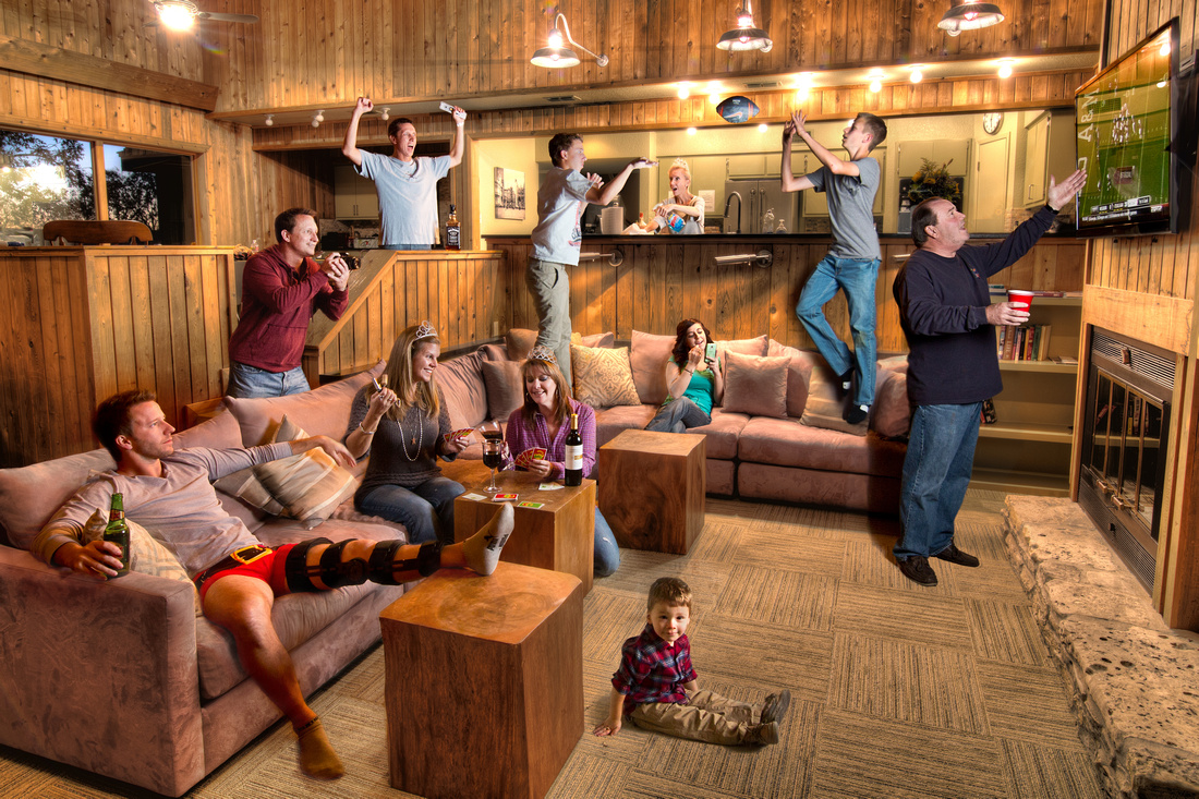 As one of my first attempts at compositing I think it came out ok. But, there are a lot of technical issues that make it fall short of the incredible work of Erik Johansson. This photo would have been virtually impossible to capture in one shot. Having everyone do the things that bring out their personality all at the same time, lighting each person at the same time, catching the football in mid air, and the fact that my nephew Caleb wasn't even there would have made this shot an impossibility without compositing.
First I shot a High Dynamic Range photo ( a combination of 5 exposures at different levels) of the empty room. That became the "canvas" that I would "paint" each person into. Then I asked each family member individually to take their pre-determined place and pose in the room. I wanted to make sure no one overlapped to make it easier in post processing. Once they took their place I adjusted my lighting and took several shots to make sure I had what I wanted. Perhaps the most important aspect of shooting the scenes is to make sure the lighting is coherent. The orientation of the light, perceived light source, location and lighting levels have to be spot on to have a cohesive finished image. In this case I knew the light sources were both from overhead and from the television. I wanted the perceived light from the TV to stand out so I set up an off camera Canon 580EXII flash behind a shoot through umbrella directly in front of the TV for all the images except for the shot of my father who is standing where the flash was. For him I had to move the light closer to the camera which isn't ideal.
The football was shot as my son (on the left) threw the ball to my nephew (on the right) who was actually standing off of the sofa during the shot. When I shot my nephew he was in the scene all alone and jumping up to catch an imaginary ball. Both my son and nephew had to do some creative imagining to get their movements and directions correct for the final image.
Processing in Photoshop, this is where the heavy lifting comes in. I'm pretty good with Photoshop but compositing is an art all in it's own. The skills to do what Erik Johansson does takes years of learning and practice to be great at. I am obviously many years away from his skill level. What happens in processing is that each person must be masked into the image a layer at a time. Getting everything correct in-camera is essential in making this process less labor intensive. Variances in light levels, light direction, light color, contrast, color, brightness, differences in any or all of these things from layer to layer (person to person) can destroy the cohesiveness of the image. This can be especially evident in the area most susceptible to error, shadows. If shadows aren't included or if they fall in weird or different directions, if they have odd light levels or color casts it can severely detract from the cohesiveness and believability of the final product.
Entire books are written on the subject of photo compositing and it's prohibitive to get into greater detail here but a good starting point is the book "Photoshop Compositing Secrets" by Matt Kloskowski .
Here is how it's done by the best, Erik Johansson:
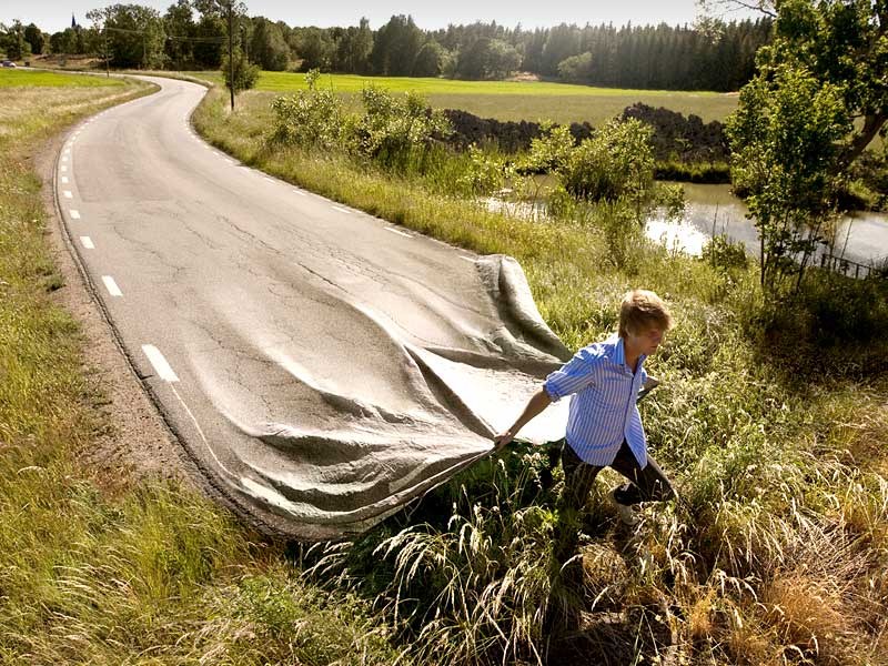
Please take the time to visit Erik's site, I'm sure you'll be as blown away as I am by his incredible work.
]]>